showProfileEditor
client.showProfileEditor({
  container: HTMLElement|id,
  accessToken: string,
  fields: Field[], (1)
  // Optional arguments
  showLabels: boolean,
  countryCode: string,
  redirectUrl: string,
  onReady: function,
  onSuccess: function,
  onError: function,
  theme: object,
  i18n: object,
  phoneNumberOptions:  object
})
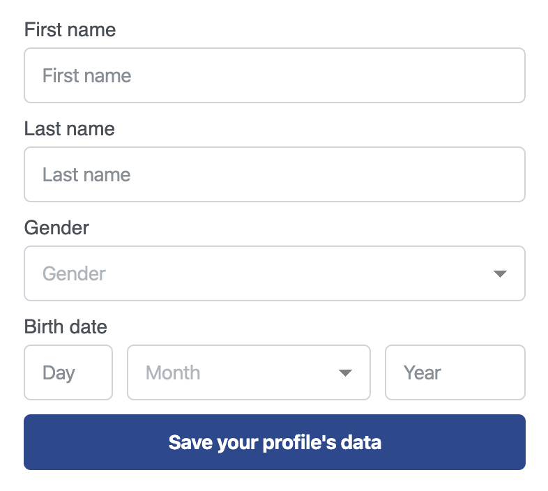
| 1 | You can force certain fields to be optional when needed by passing the key for the field and required: false as shown in the example below.
|
Examples
import { ErrorResponse } from '@reachfive/identity-ui'

const accessToken = // Here paste the authorization token of the profile retrieved after login

// The SMS feature is disabled on the ReachFive account
client.showProfileEditor({
    container: 'profile-editor-container',
    accessToken,
    fields: [
        'given_name',
        'family_name',
        'phone_number',
        'gender',
        'birthdate',
        'consents.newsletter',
        'custom_fields.loyalty_card_number',
        'address.addressType',
        'address.streetAddress',
        'address.locality',
        'address.postalCode',
        'address.country'
    ],
    showLabels: true,
    countryCode: 'US',
    onReady: instance => {
      // Destroy the widget
      // if (...) instance.destroy()
    },
    onSuccess: (event: SuccessEvent) => {
        console.log("Profile updated with success!")
    },
    onError: (error: ErrorResponse) => {
        console.error(error)
    },
    theme: {
        primaryColor: '#274890',
        borderRadius: '#374890'
    },
    i18n: {
        'save': 'Save your profile\'s data'
    }
})
Parameters
The DOM element or the |
|||||||||
The profile’s access token. |
|||||||||
List of the fields to display in the form. You can force certain fields to be optional when needed by passing the
Note on consents
Any consent used in the Archived consent with no user history/previously rejected
Previously accepted consent
|
|||||||||
Boolean for whether the signup form fields' labels are displayed on the login view. Defaults to |
|||||||||
The ISO country code useful to format phone numbers. Defaults to the predefined country code in your account settings or |
|||||||||
The URL sent in the email to which the user is redirected. This URL must be whitelisted in the |
|||||||||
Callback function called after the widget has been successfully loaded and rendered inside the container. The callback is called with the widget instance. |
|||||||||
Callback function called when the request was successful.
Takes a For a full list of event types, user event types. You can override this function with custom logic if desired: client.showProfileEditor example |
|||||||||
Callback function called when the request has failed. See our full list of SDK and API errors. You can override this function with custom logic if desired: client.showProfileEditor example |
|||||||||
The options to set up to customize the appearance of the widget. Below is an example of some of the theme attributes. For a full list, see theme attributes.
|
|||||||||
Widget labels and error messages to override. If specified, these labels and error messages override the default message regardless of the language. If unspecified, ReachFive falls back to the default wordings in every supported language. Using the
|
|||||||||
Object that lets you set display options for the phone number field. Options
|
theme attributes
|
|
|
|
|
|
|
|
|
|
|
|
|
|
|
|
|
|
|
|
|
|
|
|
|
|
|
|
|
|
|
|
|
|
|
|
|
|
|
|
|
|
|
|
|
|
|
|
|
|
|
|
|
|
|
|
|
|
|
|
|
|
|
|
|
|
|
|
|
|
|
|
|
|
|
|
|
|
|
|
|
|
|
|
|
|
|
|
|
|
|
|
|
|
|
|
|
|
|
|
|
|
|
|
|
|
|
|
|
|
|
|
|
|
|
|
|
|
|
|
|
|
|
|
|
|
|
|
|
|
|
|
|
|
|
|
|
|
|
|
|
|
|
|
|
|
|
UI labels
ReachFive has a set of default labels for UI components and fields. This includes a range of things from names and sign up fields to verification code fields, and more.
Using the i18n field, you can override these default labels to suit your particular setup.
client.showProfileEditor({
i18n: {
email: 'Your email address, por favor.'
},
…
})