gender
|
|
givenName
|
|
familyName
|
|
email
|
|
phoneNumber
|
|
identifier
|
Email address or phone number
|
verificationCode
|
|
password
|
|
oldPassword
|
|
newPassword
|
|
friendlyName
|
|
passwordConfirmation
|
|
biometrics
|
|
birthdate
|
|
save
|
|
resetPassword
|
Please enter your new password.
|
send
|
|
lastTimeYouLoggedInWith
|
Last time you logged in with
|
notYourAccount
|
|
unexpectedErrorOccurred
|
Unexpected error occurred. Please retry later.
|
confirmYourIdentity
|
To continue, please confirm your identity.
|
rememberMe
|
|
or
|
|
back
|
|
remove
|
|
add
|
|
address.streetAddress
|
|
address.locality
|
|
address.region
|
|
address.postalCode
|
|
address.country
|
|
address.title
|
|
address.addressType
|
|
address.addressType.billing
|
|
address.addressType.delivery
|
|
address.addressComplement
|
|
address.raw
|
|
address.deliveryNote
|
|
address.recipient
|
|
address.company
|
|
address.phoneNumber
|
|
login.title
|
|
login.submitLabel
|
|
login.withBiometrics
|
|
login.withPassword
|
|
login.forgotPasswordLink
|
Don’t remember your password?
|
login.signupLinkPrefix
|
|
login.signupLink
|
|
login.password.userAnotherIdentifier
|
|
signup.title
|
|
signup.submitLabel
|
|
signup.loginLinkPrefix
|
|
signup.loginLink
|
|
signup.withBiometrics
|
|
signup.withPassword
|
|
signup.awaiting.identifier.verification
|
Account created successfully.
To login, please verify your identifier with the email or the SMS that you received.
|
forgotPassword.title
|
|
forgotPassword.prompt
|
Enter the email address associated with your account, and we’ll email you a link to reset your password.
|
forgotPassword.prompt.phoneNumber
|
Please enter the phone number associated with your account. We will text you a code to reset your password.
|
forgotPassword.useEmailButton
|
|
forgotPassword.usePhoneNumberButton
|
|
forgotPassword.backToLoginLink
|
|
forgotPassword.submitLabel
|
|
forgotPassword.submitLabel.code
|
|
forgotPassword.verificationCode
|
Please enter the verification code we’ve sent to your phone, along with your new password.
|
forgotPassword.successMessage
|
An email containing a link to update your password has been sent to you.
|
passwordless.intro
|
Enter your email to sign in or create an account.
|
passwordless.emailSent
|
We sent you a link to sign in to your email.
|
passwordless.sms.intro
|
Enter your phone number to sign in or create an account.
|
passwordless.email.verification.intro
|
Please enter the verification code we sent to your email.
|
passwordless.sms.verification.intro
|
Please enter the verification code we sent to your phone.
|
passwordReset.title
|
|
passwordReset.intro
|
Please type your new password.
|
passwordReset.successTitle
|
|
passwordReset.successMessage
|
Your password has been modified. Go back to login page to authenticate yourself.
|
passwordReset.loginLink
|
|
accountRecovery.title
|
|
accountRecovery.prompt
|
Enter the email address associated with your account, and we will send you a link to reset your credentials.
|
accountRecovery.submitLabel
|
|
accountRecovery.successMessage
|
An email containing a link to reset your credentials has been sent to you.
|
accountRecovery.backToLoginLink
|
|
accountRecovery.password.title
|
|
accountRecovery.passkeyReset.title
|
|
accountRecovery.passkeyReset.successTitle
|
|
accountRecovery.passkeyReset.successMessage
|
Your previous passkeys have been invalidated. You can remove them from your credential manager as well. You can go back to the Login page to authenticate yourself.
|
accountRecovery.passkeyReset.loginLink
|
|
accountRecovery.passkeyReset.intro
|
Sign-in faster and safer with passkeys.
|
accountRecovery.passkeyReset.subtitle1
|
|
accountRecovery.passkeyReset.legend1
|
Passkeys are encrypted digital keys you create using your fingerprint, face, or screen lock.
|
accountRecovery.passkeyReset.subtitle2
|
Where are passkeys saved?
|
accountRecovery.passkeyReset.legend2
|
Passkeys are saved to your password manager, so you can sign in on other devices.
|
accountRecovery.passkeyReset.button
|
|
emailEditor.intro
|
Please enter your new email address
|
emailEditor.successMessage
|
Your request has been processed successfully. Please check now your mailbox: a verification email has been sent to it.
|
emailEditor.successMessage
|
Your request has been processed successfully. Please check now your mailbox: a verification email has been sent to it.
|
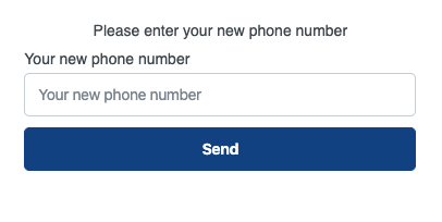
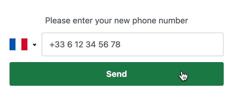
phoneNumberEditor.intro
|
Please enter your new phone number
|
phoneNumberEditor.verification.intro
|
Please enter the verification code we sent to your phone.
|
socialAccounts.noLinkedAccount
|
No linked third-party account
|
socialAccounts.linkNewAccount
|
|
webauthn.registredDevices.list
|
List of registered devices
|
webauthn.registredDevices.no.list
|
|
webauthn.registredDevices.add
|
Enter a device name below to add a device
|
webauthn.registredDevices.confirm.removal
|
Do you confirm that you want to remove the device?
|
webauthn.registredDevices.createdAt
|
|
webauthn.registredDevices.lastUsedAt
|
|
webauthn.friendly.name
|
|
passwordStrength.minimum.required
|
The minimum required strength is
|
passwordStrength.score0
|
|
passwordStrength.score1
|
|
passwordStrength.score2
|
|
passwordStrength.score3
|
|
passwordStrength.score4
|
|
day
|
|
month
|
|
year
|
|
january
|
|
february
|
|
march
|
|
april
|
|
may
|
|
june
|
|
july
|
|
august
|
|
september
|
|
october
|
|
november
|
|
december
|
|
dateFormat
|
|
genders.male
|
|
genders.female
|
|
genders.other
|
|
form.required.fields
|
|
validation.birthdate.dayOfMonth
|
The day doesn’t look right. Be sure to use a 2-digit number that is a day of the month.
|
validation.birthdate.yearLimit
|
Age must be between 6 and 129.
|
validation.birthdate.year
|
The year doesn’t look right. Be sure to use an actual date of birth with four digits.
|
validation.required
|
|
validation.checked
|
Please check the box to continue.
|
validation.email
|
This is not a valid email.
|
validation.phone
|
This is not a valid phone number.
|
validation.identifier
|
This is not a valid email or phone number.
|
validation.integer
|
This is not a valid integer.
|
validation.float
|
This is not a valid float number.
|
validation.date
|
This is not a valid date. The expected format is 'mm/dd/yyyy'
|
validation.passwordMatch
|
Passwords are not the same.
|
validation.password.must.contain
|
Your password must contain:
|
validation.password.minLength
|
At least {min} characters.
|
validation.password.maxLength
|
Please limit your password to a maximum of {max} characters.
|
validation.password.minStrength
|
Some of the most used words and names may be prohibited.
|
validation.password.specials.characters
|
At least one special character.
|
validation.password.specials.lowercase
|
At least one lowercase character.
|
validation.password.specials.uppercase
|
At least one uppercase character.
|
validation.password.specials.digit
|
At least one digit character.
|
mfa.register.email
|
|
mfa.verify.email
|
Please enter the code you received by Email
|
mfa.email.explain
|
Use your email identifier as a 2FA
|
mfa.email.explain.required
|
Please activate your email as second factor to log in
|
mfa.email.registered
|
|
mfa.phoneNumber.explain
|
Use this phone number as a 2FA
|
mfa.verify.sms
|
Please enter the code you received by SMS
|
mfa.phoneNumber.registered
|
Phone number registered as 2FA
|
mfa.register.phoneNumber
|
|
mfa.email.alreadyRegistered
|
Email already registered as a 2FA
|
mfa.stepUp.start
|
Start a strong authentication
|
mfa.stepUp.trustDevice
|
|
mfa.select.factor
|
Please select your factor
|
mfa.email.remove.explain
|
Disable email second factor
|
mfa.phoneNumber.remove.explain
|
Disable phone number second factor
|
mfa.remove.email
|
Disable email second factor
|
mfa.remove.phoneNumber
|
Disable phone number as second factor
|
mfa.email.removed
|
Email as a second factor has been disabled
|
mfa.phoneNumber.removed
|
Phone number disabled as a second factor
|
mfaList.noCredentials
|
|
mfaList.createdAt
|
|